Project details
Role : UIX Designer
Tools :
Figma,Wordpress,Elementor
Serendib Royal Spice – A Taste of Sri Lanka, Delivered Digitally
Serendib Royal Spice is a well-established Sri Lankan spice export company with a legacy that traces back to 1992. While the brand had strong roots in sourcing, exporting, and maintaining high-quality spices like cloves, cardamom, and areca nuts, it lacked an online presence that could properly reflect the brand's value, culture, and trustworthiness.
The goal was clear: they needed a professional, informative website that could serve as a digital front door to global clients — exporters, retailers, and wholesalers. The challenge was to translate their rich history and commitment to quality into a modern website that remained simple, credible, and accessible to a non-technical, global audience.
There were also content gaps: most spice product pages only had the name and image. No online ordering or checkout system was required, but it was essential that users could understand what the company offers and how to contact them easily.
The Solution: A Clean, Informative, and Trust-Building Website
The solution was to design and develop a clean, modern, and easy-to-navigate brochure-style website using WordPress and Elementor.
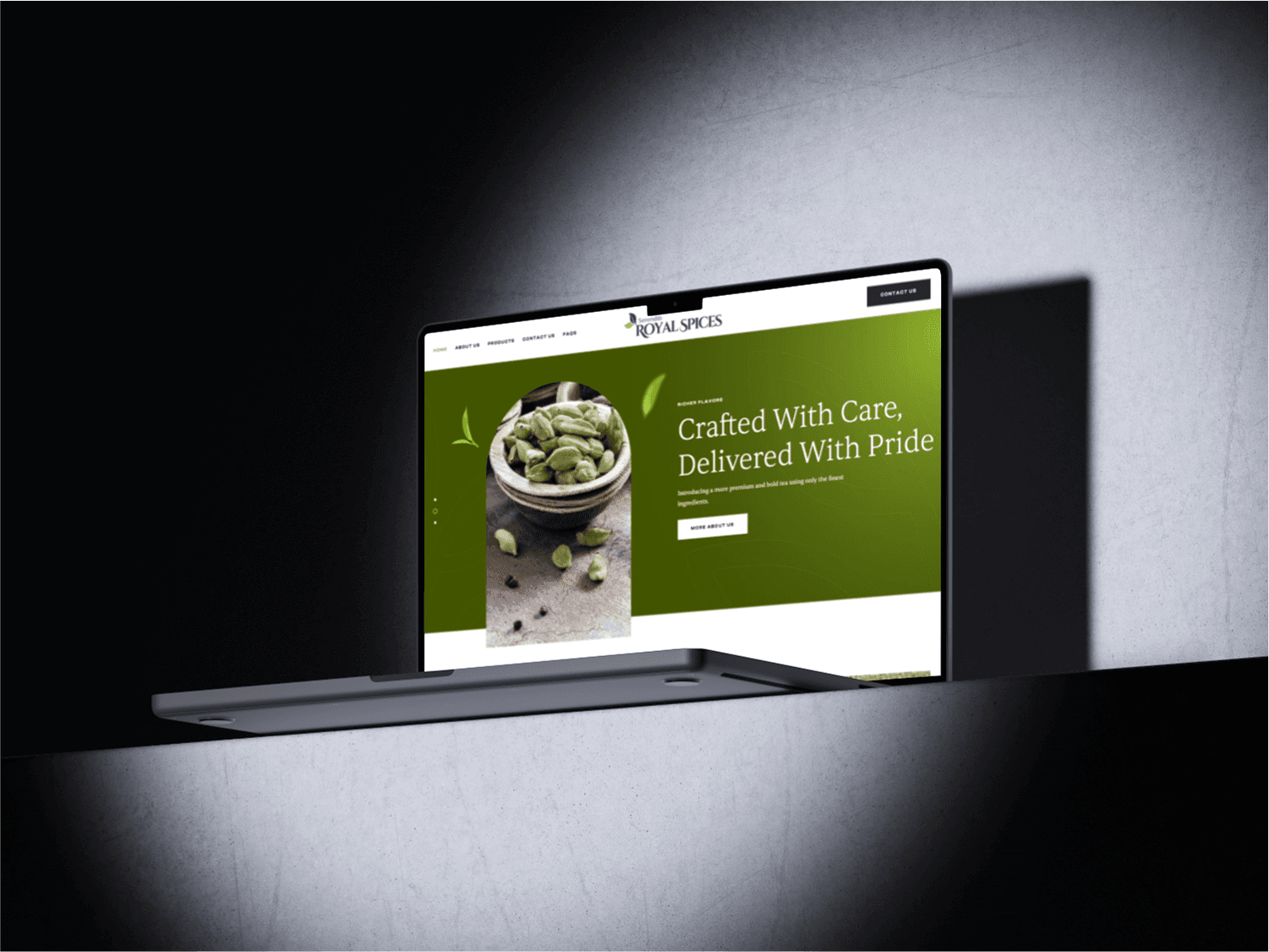
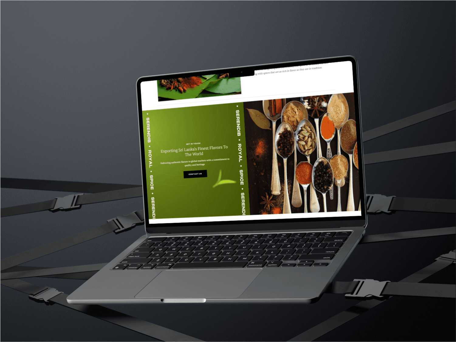
The design aligns closely with the brand’s visual identity — featuring green tones that represent freshness, nature, and organic authenticity. The homepage showcases strong messaging such as “Where Tradition Meets Taste,” setting the tone for trust and quality. Key sections highlight:
The brand’s mission and founding story (About Us)
The main spice categories (Cloves, Cardamom, Areca nut)
A Contact page for business inquiries (Call and email options)
To strengthen their global appeal, the homepage also includes badges like “Top Rated Customer Service,” “Secure Payment Methods,” and “Worldwide Delivery,” even though the current site doesn’t include e-commerce. This anticipates potential growth.
While the spice product pages are currently minimal (with no full product descriptions), the visual layout and hierarchy create a clear and professional structure that makes it easy for visitors to understand the offering at a glance.
The Solution: A Clean, Informative, and Trust-Building Website
The solution was to design and develop a clean, modern, and easy-to-navigate brochure-style website using WordPress and Elementor.
The design aligns closely with the brand’s visual identity — featuring green tones that represent freshness, nature, and organic authenticity. The homepage showcases strong messaging such as “Where Tradition Meets Taste,” setting the tone for trust and quality. Key sections highlight:
The brand’s mission and founding story (About Us)
The main spice categories (Cloves, Cardamom, Areca nut)
A Contact page for business inquiries (Call and email options)
To strengthen their global appeal, the homepage also includes badges like “Top Rated Customer Service,” “Secure Payment Methods,” and “Worldwide Delivery,” even though the current site doesn’t include e-commerce. This anticipates potential growth.
While the spice product pages are currently minimal (with no full product descriptions), the visual layout and hierarchy create a clear and professional structure that makes it easy for visitors to understand the offering at a glance.
The Design & Development Process: UI/UX Principles in Action
Methodology: User-Centered Design (UCD)
The approach followed a User-Centered Design methodology, focusing on the needs of the end users: buyers and exporters who need clear information, contact methods, and visual assurance of trust. Every design decision was rooted in the assumption that users may be unfamiliar with the brand but are looking for trustworthy, premium-quality spices.
UI/UX Techniques Applied:
Typography: A mix of serif and sans-serif fonts to reflect a traditional yet professional tone. The hero text uses elegant font sizing for emphasis, while body copy is kept minimal and easy to read.
Color System: A green-based palette reflecting freshness and organic authenticity, helping reinforce the natural quality of the products.
Visual Hierarchy: Large banners with impactful headlines, followed by clean product blocks that guide the user down the page.
Navigation Simplicity: A minimal top navigation with only essential links (Home, About, Contact), helping reduce friction for users.
Development in WordPress:
No coding involved: The website was entirely built using WordPress + Elementor, ideal for the client’s needs and budget.
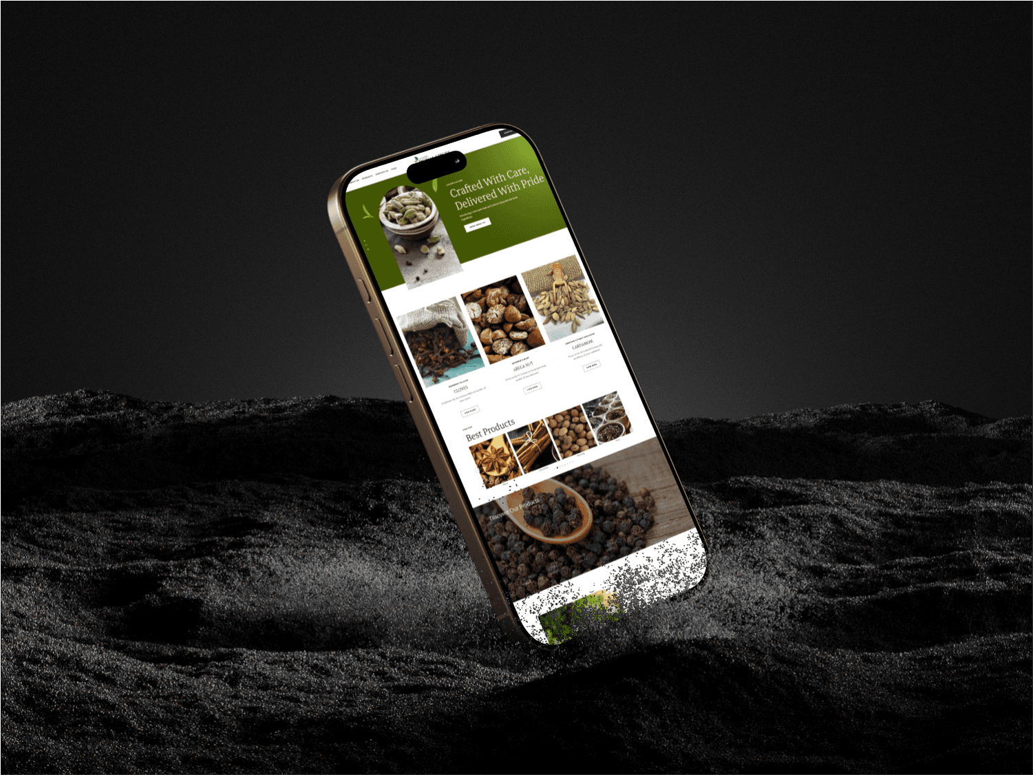
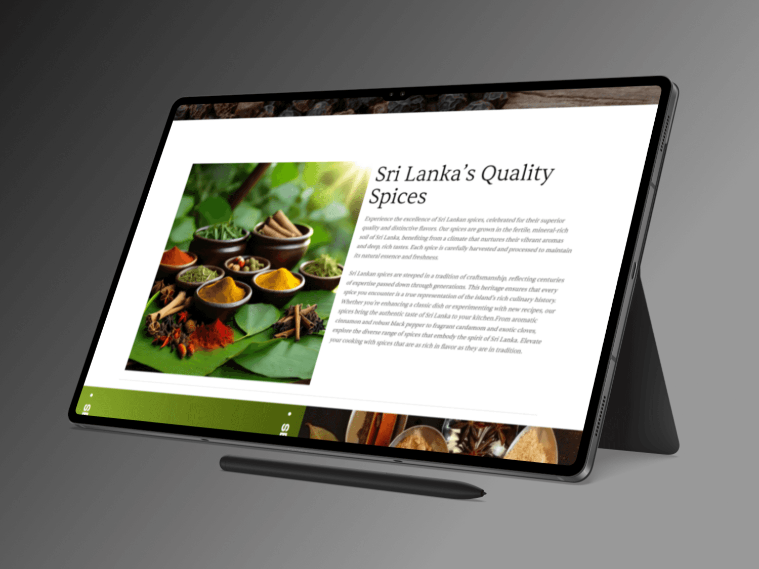
Fully responsive: Every section was optimized for mobile, tablet, and desktop devices.
Modular layout: Used pre-built and custom Elementor blocks to ensure consistency and easy updates by the client.
Speed and performance: Optimized images and minimized unnecessary plugins for fast loading.
Final Outcome
The final website is a well-crafted representation of Serendib Royal Spice’s dedication to quality and tradition. It serves as a credible and professional brand platform that the company can proudly share with global partners. Though simple in content, it lays a strong foundation for future enhancements — such as adding detailed product pages, e-commerce, or blog content about spice origins and benefits.
This project is an example of how even small websites can use smart UX design principles, thoughtful UI styling, and the right tools like WordPress to make a lasting impression.
The Design & Development Process: UI/UX Principles in Action
Methodology: User-Centered Design (UCD)
The approach followed a User-Centered Design methodology, focusing on the needs of the end users: buyers and exporters who need clear information, contact methods, and visual assurance of trust. Every design decision was rooted in the assumption that users may be unfamiliar with the brand but are looking for trustworthy, premium-quality spices.
UI/UX Techniques Applied:
Typography: A mix of serif and sans-serif fonts to reflect a traditional yet professional tone. The hero text uses elegant font sizing for emphasis, while body copy is kept minimal and easy to read.
Color System: A green-based palette reflecting freshness and organic authenticity, helping reinforce the natural quality of the products.
Visual Hierarchy: Large banners with impactful headlines, followed by clean product blocks that guide the user down the page.
Navigation Simplicity: A minimal top navigation with only essential links (Home, About, Contact), helping reduce friction for users.
Development in WordPress:
No coding involved: The website was entirely built using WordPress + Elementor, ideal for the client’s needs and budget.
Fully responsive: Every section was optimized for mobile, tablet, and desktop devices.
Modular layout: Used pre-built and custom Elementor blocks to ensure consistency and easy updates by the client.
Speed and performance: Optimized images and minimized unnecessary plugins for fast loading.
Final Outcome
The final website is a well-crafted representation of Serendib Royal Spice’s dedication to quality and tradition. It serves as a credible and professional brand platform that the company can proudly share with global partners. Though simple in content, it lays a strong foundation for future enhancements — such as adding detailed product pages, e-commerce, or blog content about spice origins and benefits.
This project is an example of how even small websites can use smart UX design principles, thoughtful UI styling, and the right tools like WordPress to make a lasting impression.