Project details
Role : UIX Designer
Tools :
Figma
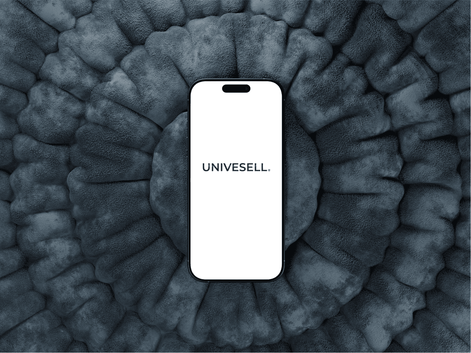
Universal – Modern Event Planning App UI Design
Universal Wedding & Event Planning is a professional event coordination company aiming to streamline the way clients plan weddings, parties, and corporate events. When they approached me, they had a clear vision — to create a user-friendly mobile app that could bridge the gap between vendors and clients, allowing both parties to manage their event journey seamlessly.
The company already had an internal idea of what they wanted the app to look and feel like. They provided design inspiration, branding direction, and a predefined design system. My role was to bring this vision to life through a fully polished UI design, focusing on clarity, usability, and aesthetic cohesion across all screens.
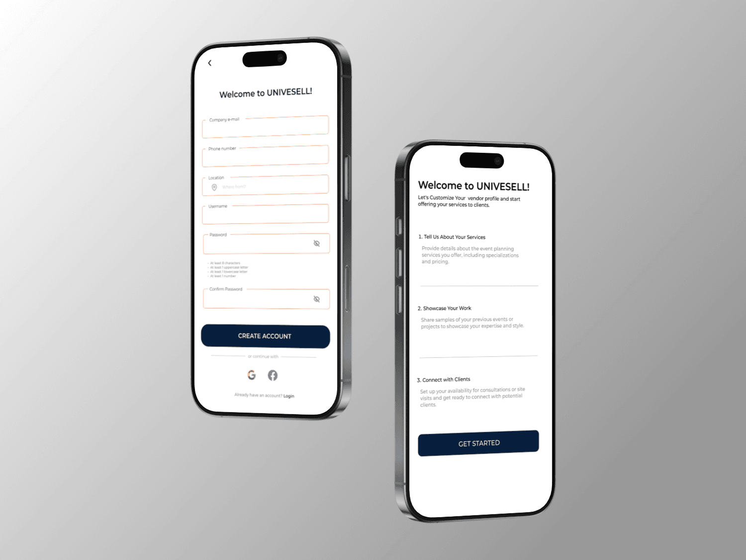
The project required 20+ mobile app screens, tailored for both vendors and clients, including onboarding, profile creation, service browsing, booking workflows, and vendor management.
The Solution: A Clean, Elegant Interface That Unifies Vendors & Clients
My primary goal was to deliver a sleek, consistent UI design that clearly distinguished the user flows of event organizers (clients) and service providers (vendors), without compromising visual unity. Leveraging the provided brand identity and component library, I created high-fidelity screens that reflect modern design trends while staying true to the client’s brand.
Some of the key screens include:
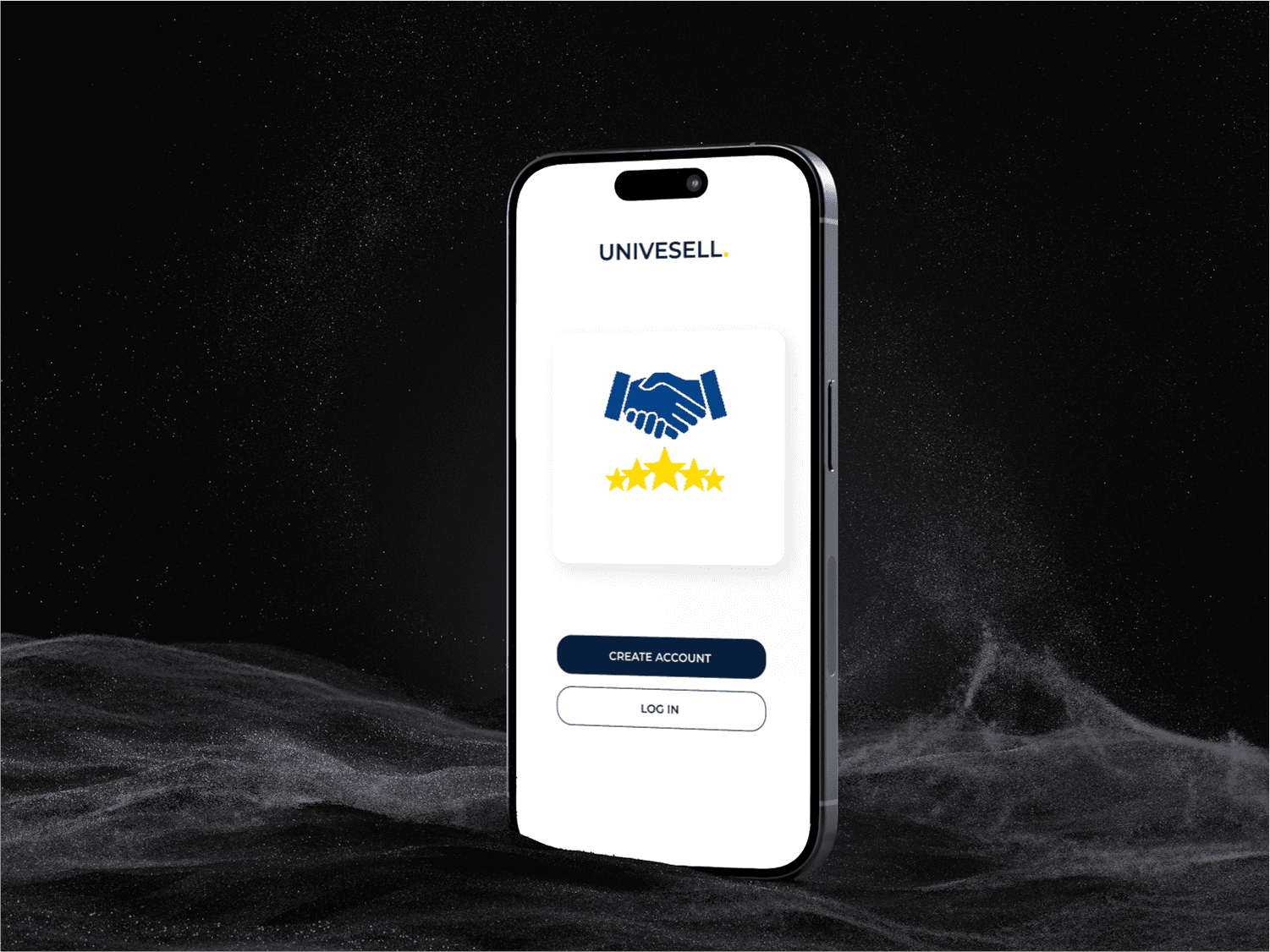
Onboarding Screens: Introducing new users to the app’s purpose with friendly illustrations and a welcoming tone.
Vendor Profiles: Featuring detailed listings with service images, pricing, ratings, and availability.
Client Dashboard: Offering a clear overview of upcoming bookings, favorite vendors, and budget tracking.
Search & Filters: Designed for easy navigation through categories like décor, venues, catering, and photography.
Booking Flow: Step-by-step interactions designed for minimal friction — from selection to confirmation.
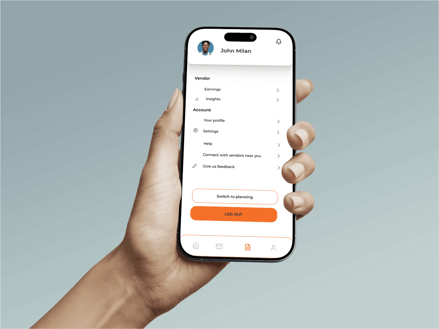
Vendor Dashboard: A tailored experience for vendors to manage bookings, profiles, and schedules efficiently.
By focusing on a modular grid system, clean white space, and strategic accent colors, I ensured that each screen felt connected yet served its unique functional goal. Buttons, cards, tabs, and forms followed consistent padding and typography rules to create visual balance and intuitive navigation.
The Solution: A Clean, Elegant Interface That Unifies Vendors & Clients
My primary goal was to deliver a sleek, consistent UI design that clearly distinguished the user flows of event organizers (clients) and service providers (vendors), without compromising visual unity. Leveraging the provided brand identity and component library, I created high-fidelity screens that reflect modern design trends while staying true to the client’s brand.
Some of the key screens include:
Onboarding Screens: Introducing new users to the app’s purpose with friendly illustrations and a welcoming tone.
Vendor Profiles: Featuring detailed listings with service images, pricing, ratings, and availability.
Client Dashboard: Offering a clear overview of upcoming bookings, favorite vendors, and budget tracking.
Search & Filters: Designed for easy navigation through categories like décor, venues, catering, and photography.
Booking Flow: Step-by-step interactions designed for minimal friction — from selection to confirmation.
Vendor Dashboard: A tailored experience for vendors to manage bookings, profiles, and schedules efficiently.
By focusing on a modular grid system, clean white space, and strategic accent colors, I ensured that each screen felt connected yet served its unique functional goal. Buttons, cards, tabs, and forms followed consistent padding and typography rules to create visual balance and intuitive navigation.
The UI Design Process: Organized, Efficient, and Scalable
Methodology: Interface Design with a Component-Driven Approach
This project followed a UI-focused, component-driven design process. While no UX research or persona creation was involved, I adhered to visual systemization and reusability practices to maintain consistency.
UI Techniques & Principles Used:
Design System Application: All components (buttons, text fields, cards, icons) were taken from or customized within the provided system, ensuring visual consistency across screens.
Wireframing: Initial low-fidelity wireframes helped map the flow before jumping into high-fidelity design, giving structure and clarity to the layout plan.
Typography Hierarchy: Used font sizing and weights to guide user focus — from bold headers to subtle metadata.
Color Psychology: Soft and elegant color palettes evoked calmness and professionalism, appropriate for event planning.
Spacing & Layout: Applied grid-based layouts and generous white space to improve readability and reduce cognitive load.
All screens were delivered as high-fidelity mockups, suitable for both client review and developer handoff. The UI was created to be fully responsive and easy to translate into code, with clear naming conventions and layered organization.
Final Outcome
The Universal Event Planning App UI design project resulted in a polished, intuitive, and brand-aligned interface for both clients and vendors. Even without deep UX research, the design successfully reflects a seamless experience flow — one that can easily be developed into a full-fledged product.
The client was extremely satisfied with the visual direction and usability of the screens, which now form the foundation of their mobile application development phase.
This project is a strong example of UI design excellence built on collaboration, design system implementation, and visual clarity — especially when working within structured brand guidelines.